British Seasons: Making a Textile Collection Week 5 — Colour & Seasons
Post 5: Working with Colour.
Colour has always been my favourite part of being a textile designer.
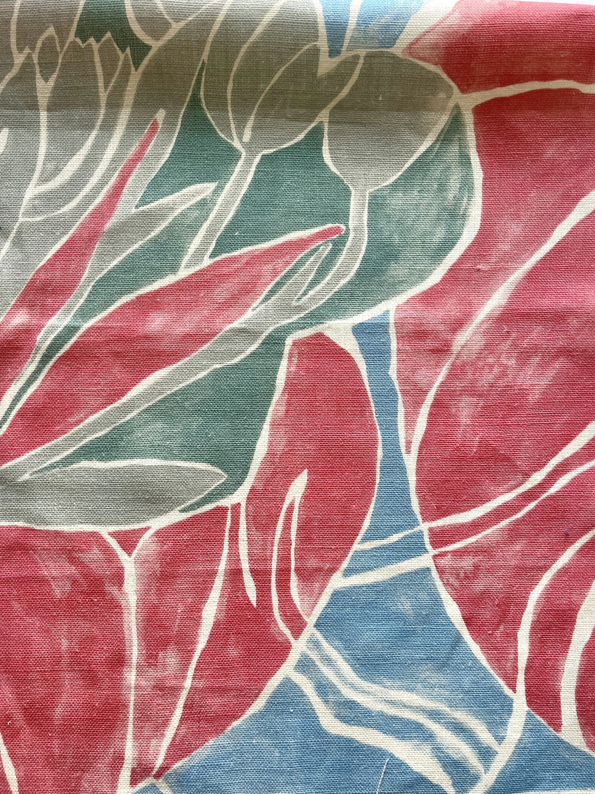
There is something deeply satisfying about mixing paints and watching colours come together to form a palette. It’s not just about choosing beautiful tones; it’s about balance — how colours interact with one another, how much of each colour is used, and how they guide the eye across a pattern.
A colour can feel completely different depending on what sits beside it. The same yellow might appear bright and energetic next to green, but soft and muted beside rust or ochre. Much of my work is about finding that balance so that a design feels harmonious and something people will enjoy living with every day.
A Colour Diary of the Seasons
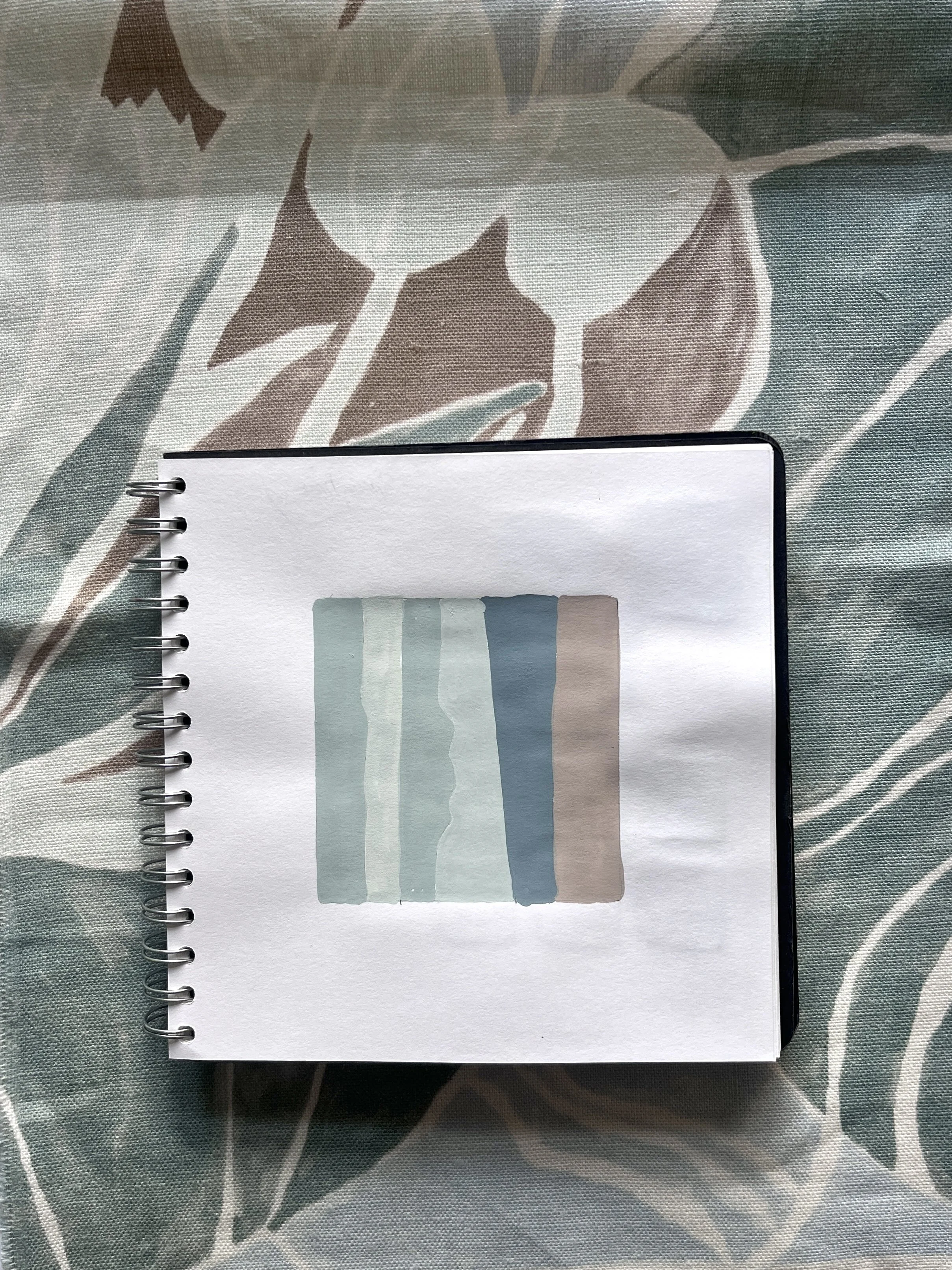
Over time I have built a colour diary that follows the subtle shifts of colour I notice throughout the year.
Sometimes this comes directly from nature — the soft greens of early spring, the saturated tones of summer gardens, the earthy warmth of autumn, or the cool restraint of winter light.
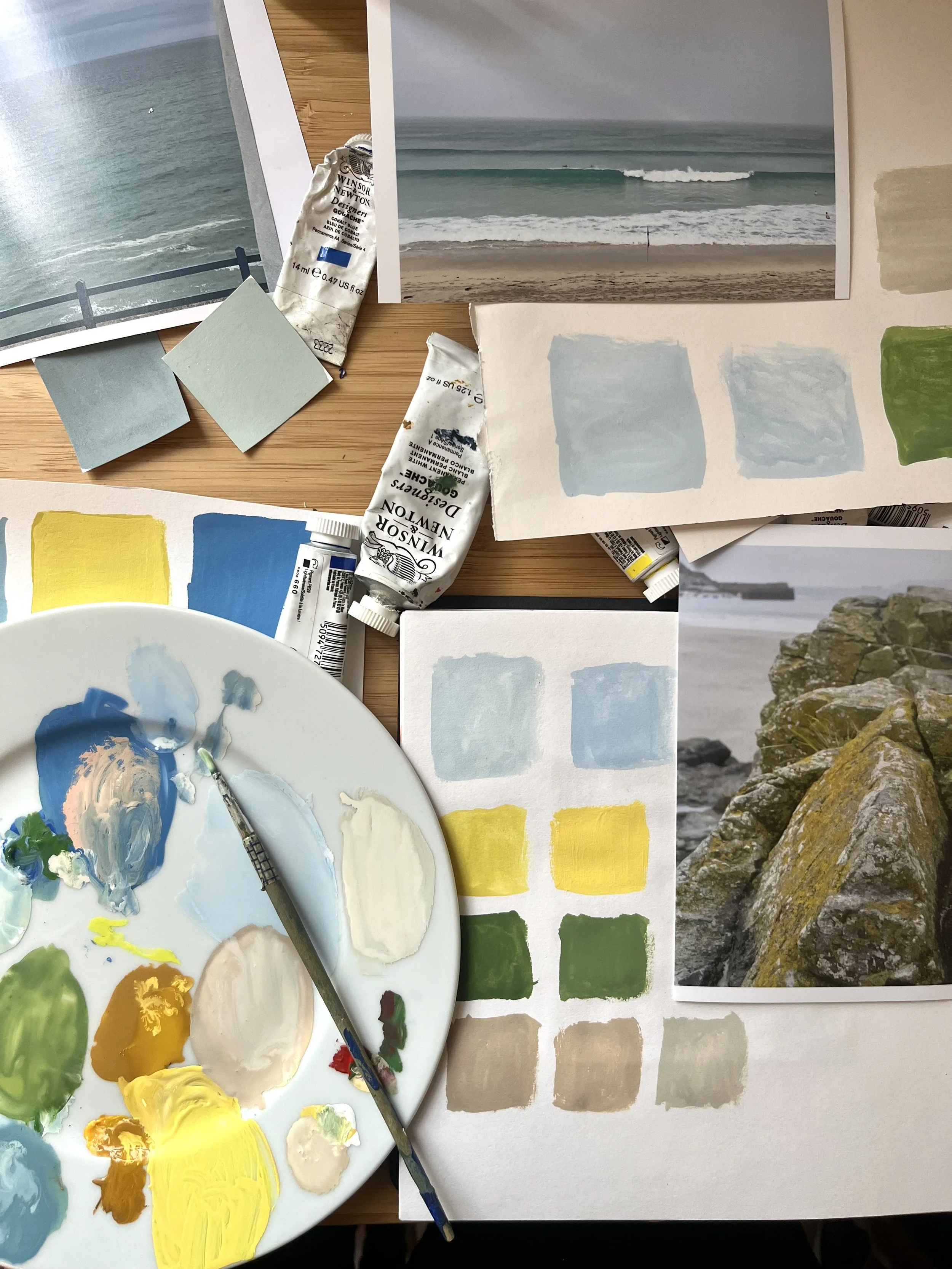
At other times I capture a colour combination I notice while out and about: a shopfront, a shadow across pavement, flowers in a park. I mix paints and record the tones in my sketchbook, often as abstract shapes. Alongside this I photograph colours every day, building a large visual library that feeds back into my studio work.
All of these small observations are now shaping the palettes for my new textile collection, British Seasons.
Colourways for British Seasons
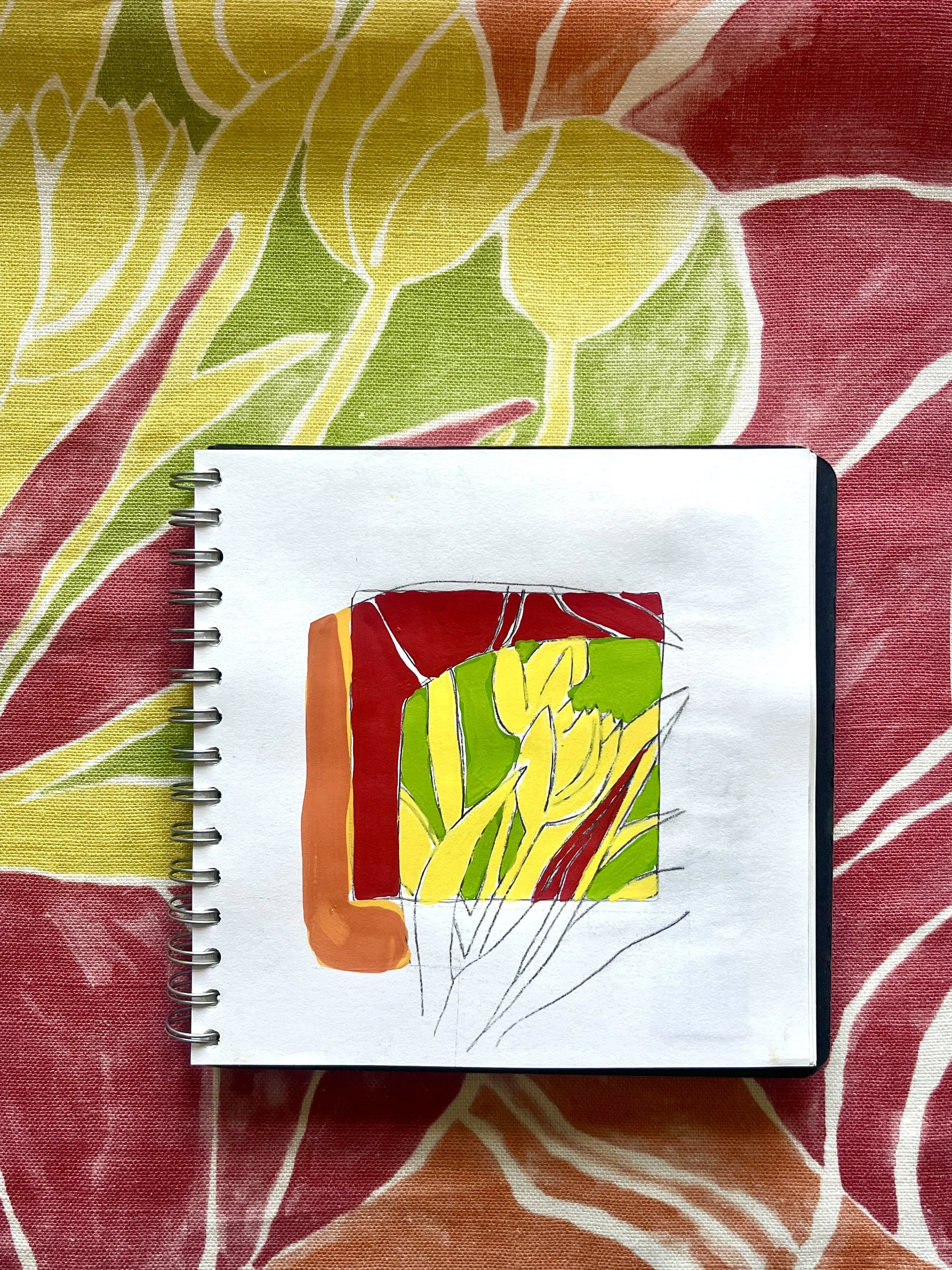
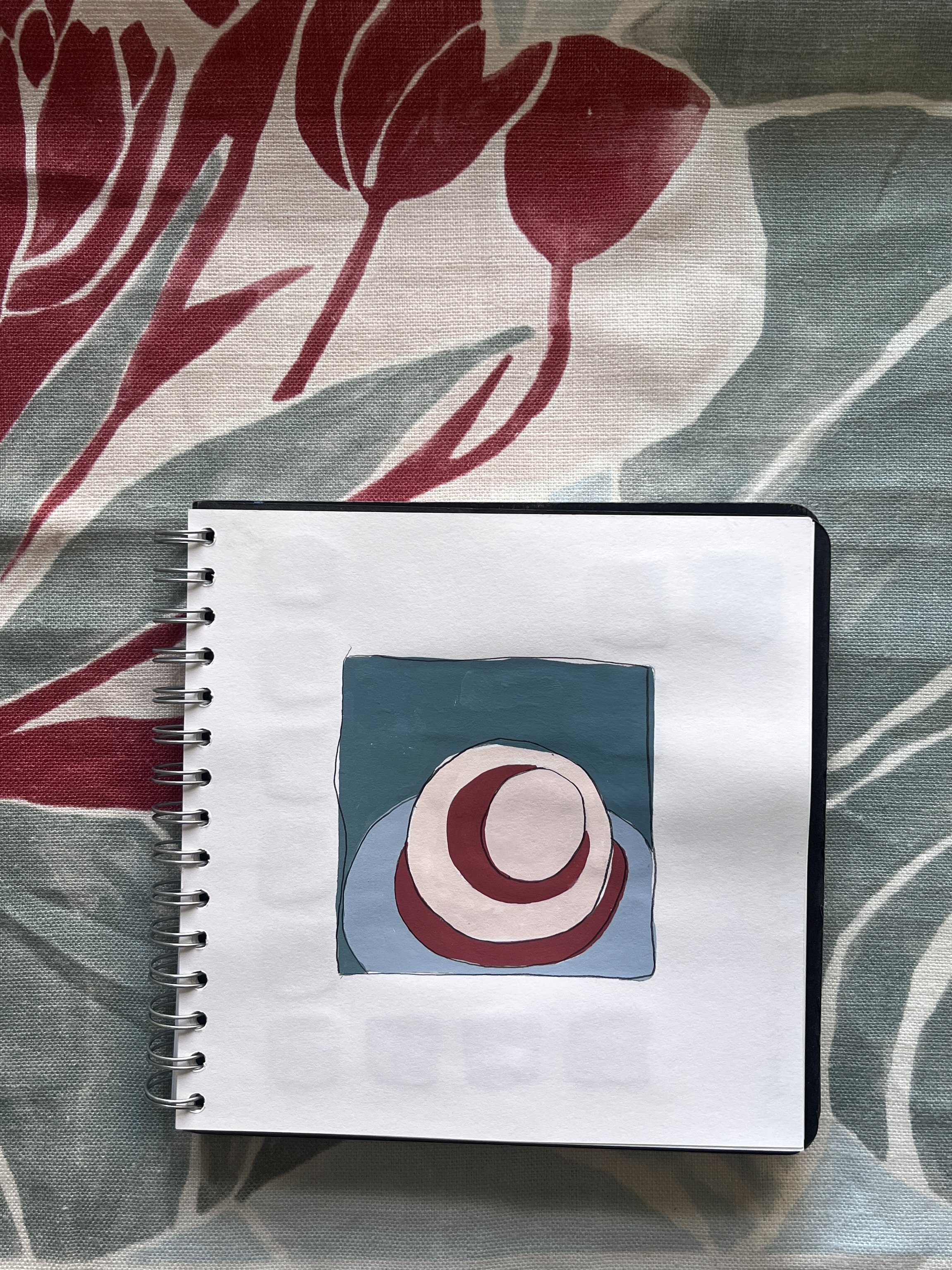
So far I have been experimenting with several colourways for the Tulips design, including:
Rusty Red
Keukenhof
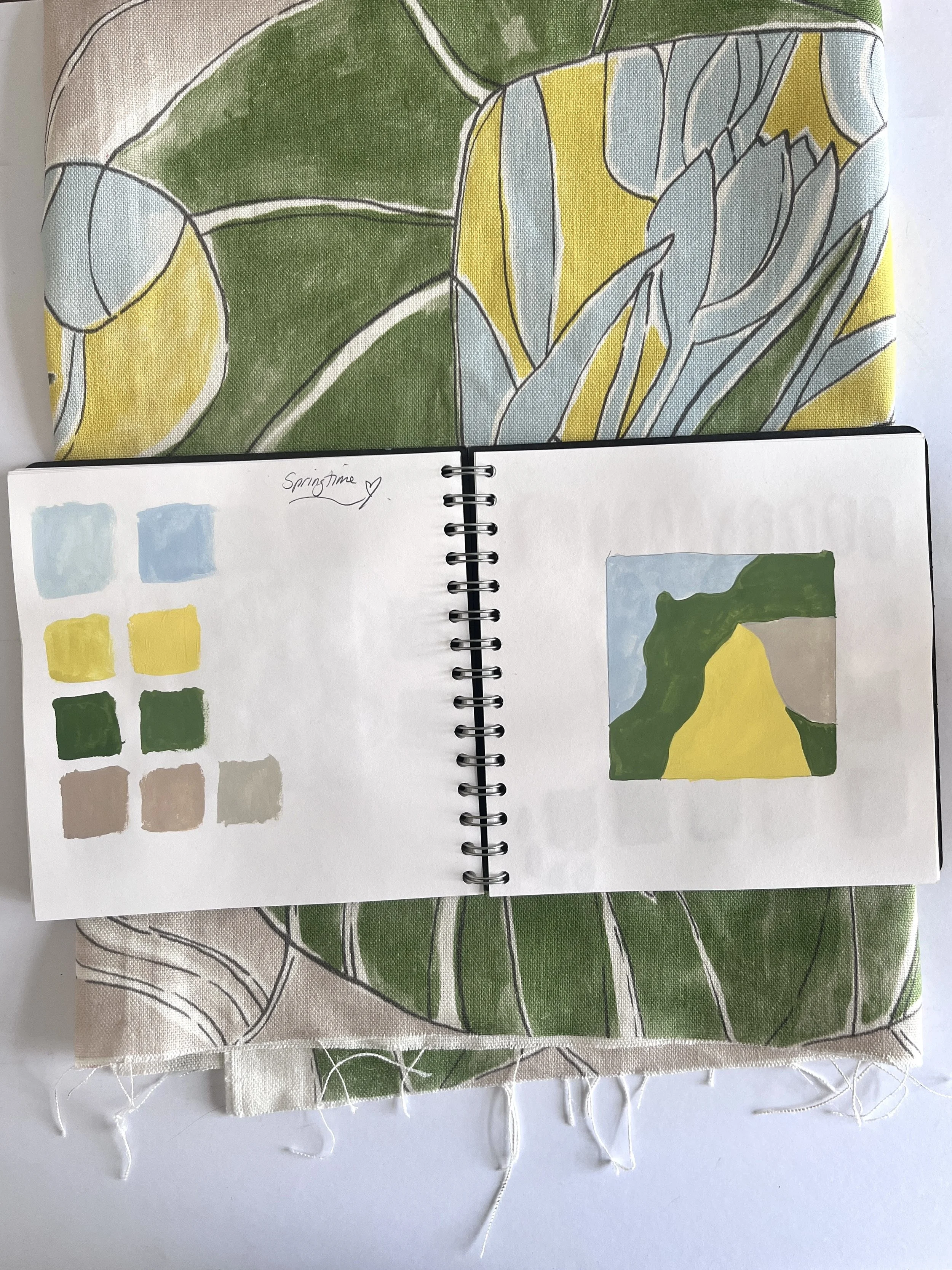
Springtime
Kew
St Ives
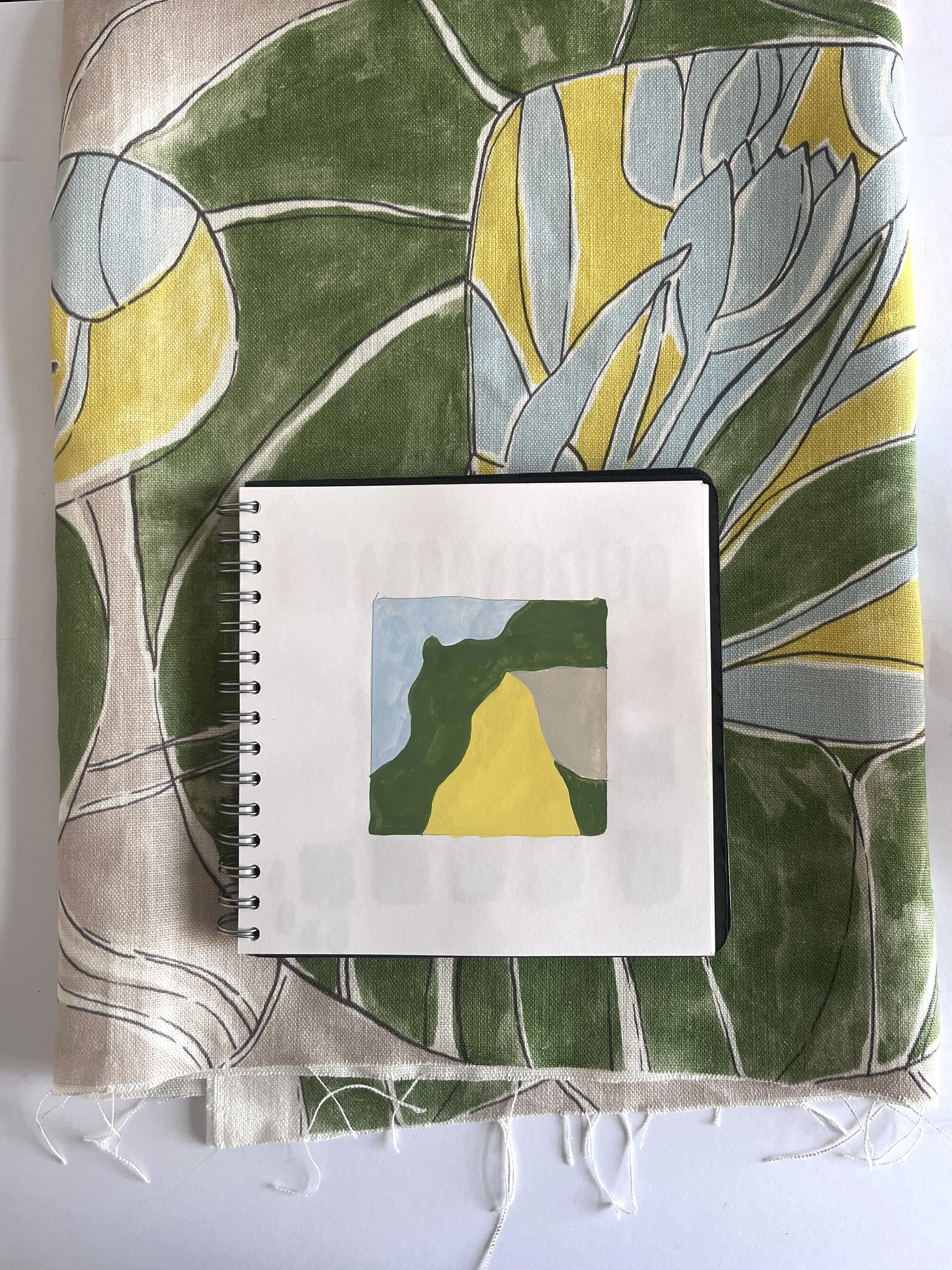
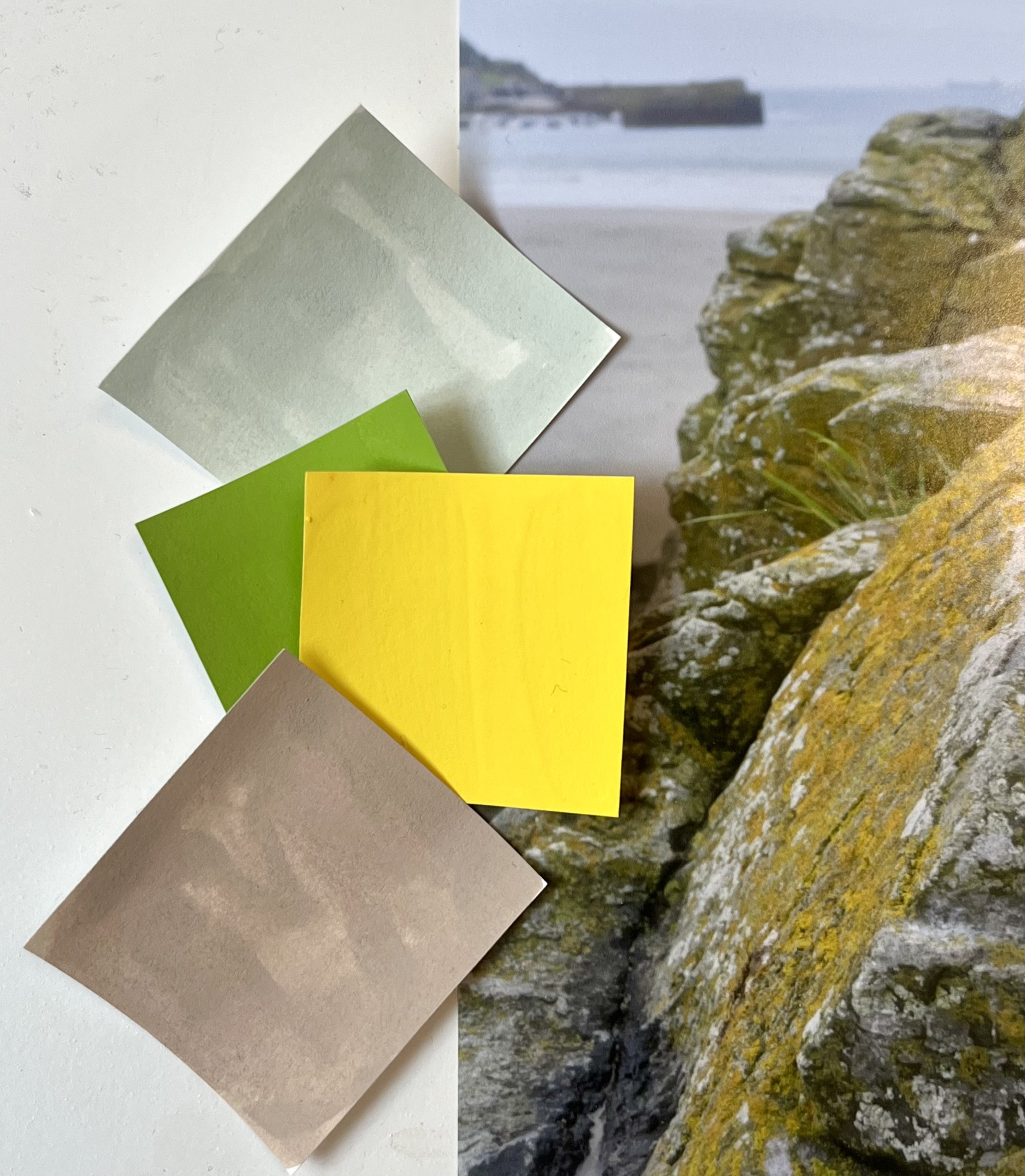
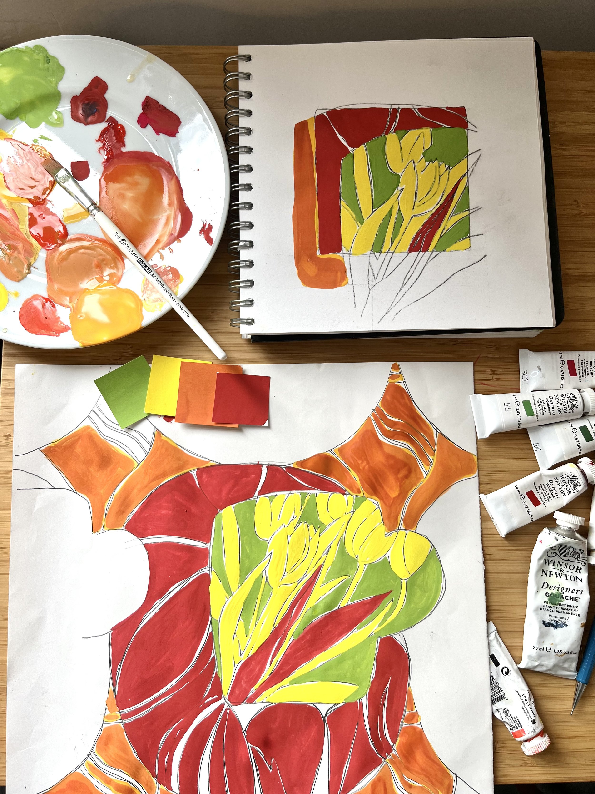
My favourite is Springtime — a fresh combination of yellows and greens that captures the feeling of early spring light and new growth.
However, I am now beginning to consider a slightly different approach for the collection as a whole: creating one key colourway for each season.
The collection itself is built around four designs:
Crocus — Winter
Tulips — Spring
Foxgloves — Summer
Autumn Trees — Autumn
I love the idea that each design could carry the essence of its season through colour — a palette that instantly evokes that time of year.
But I’d love to hear what you think: would you prefer several colourways for each design, or one carefully considered seasonal palette?
Bespoke Colour
One of the advantages of the way I design and produce textiles is that bespoke colourways are surprisingly easy to create.
If a client has a particular palette in mind, I can generate a digital visual of the design in their chosen colours. Once they are happy with the direction, we produce a colour trial on fabric before the final print is approved.
This approach means I don’t need to hold large stocks of fabric in multiple colourways. Instead, pieces are printed to order, which reduces waste and allows clients to create something truly personal.
Colour is such an individual experience — what one person loves, another might avoid completely. My aim is to create designs that people connect with, while giving them the freedom to shape the palette in a way that feels right for their own space.
These designs still feel very much like artworks to me — paintings that will eventually live in interiors as blinds, curtains, or fabric panels.
And as always, everything begins with colour.
More soon, from the studio.
#BritishSeasons #TextileDesign #ColourDesign #SurfacePattern #InteriorTextiles #FabricCollection #DesignProcess #ColourPalette