
Inspiration from Svenskt Tenn, Stockholm
Why we should be braver with pattern, colour and the natural world in our interiors.
Stockholm is one of my favourite cities. I love its design sensibility, the food, and above all, the beautiful quality of light that shifts across the water. There is something about the way the Swedes approach design that feels both considered and wonderfully relaxed.
One of my favourite places to visit is Svenskt Tenn, the iconic Stockholm interiors shop that celebrates the natural world through colour, pattern, craftsmanship and an unmistakable sense of individuality.
I visited again a few weeks ago, and it was such an inspiring and joyful experience. I found myself looking at all the little details, the unexpected combinations and the clever ways pattern had been brought into the rooms. I came away thinking about how much we can learn from a shop that is so confident in its use of colour and print.
As a textile designer, I have always believed that pattern has the power to transform a space. Yet it can sometimes feel like something to be approached cautiously in architectural and interior projects. We can become so focused on creating calm, neutral spaces that we forget how much pleasure a beautiful fabric, a bold colour or an unexpected print can bring.
Walking around Svenskt Tenn was a wonderful reminder of what happens when we allow ourselves to be a little braver.
The joy is in the details…
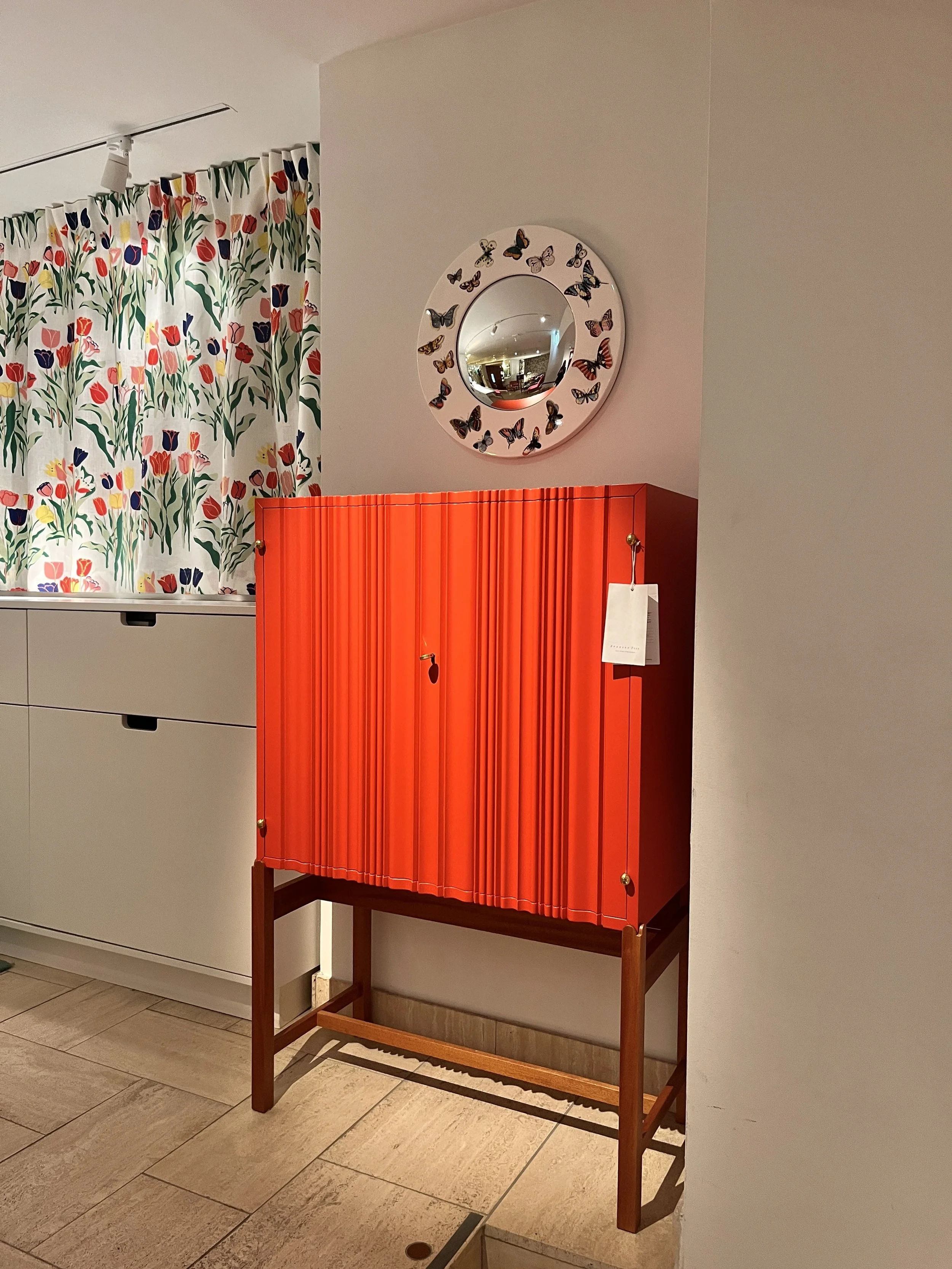

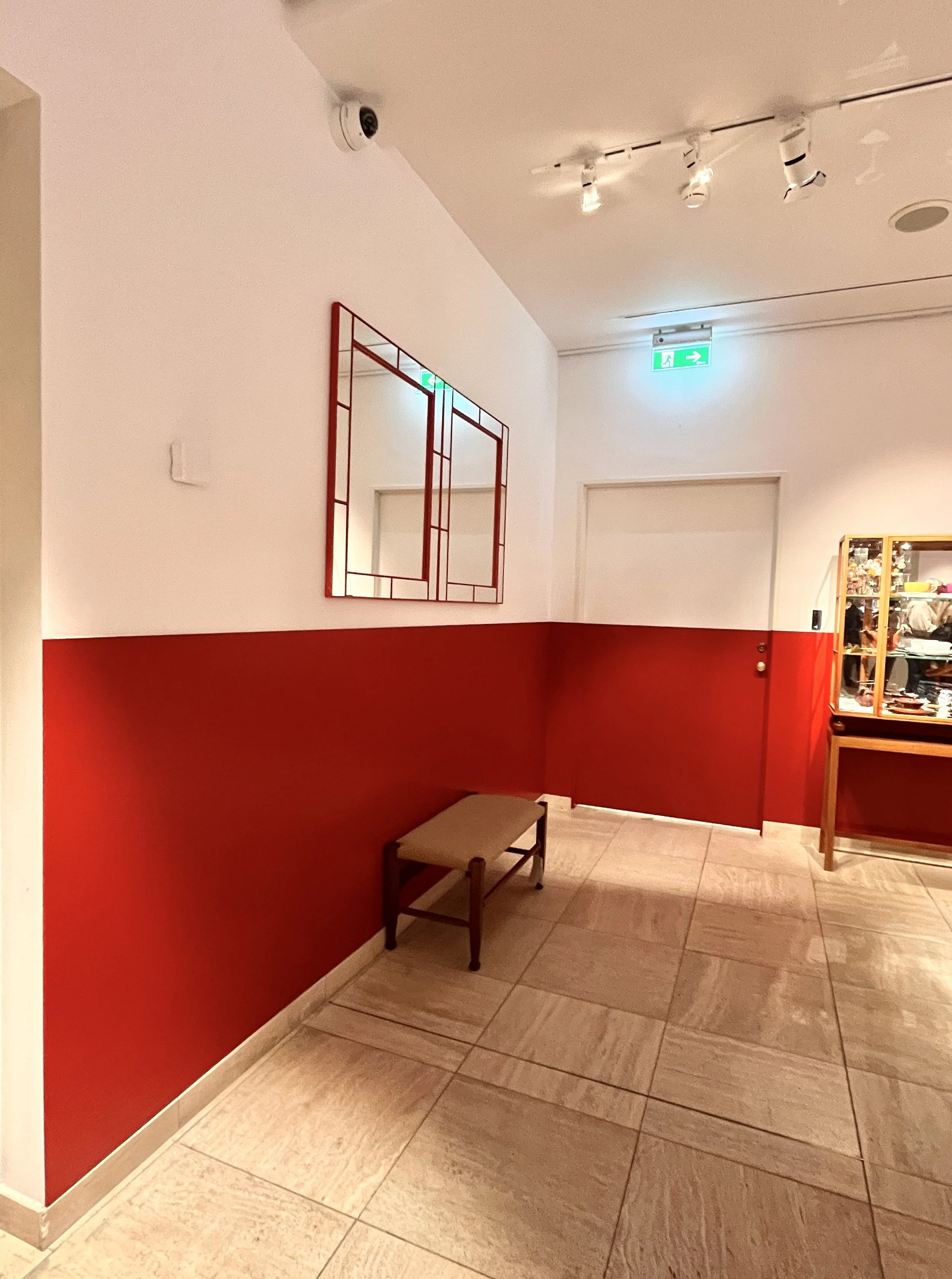
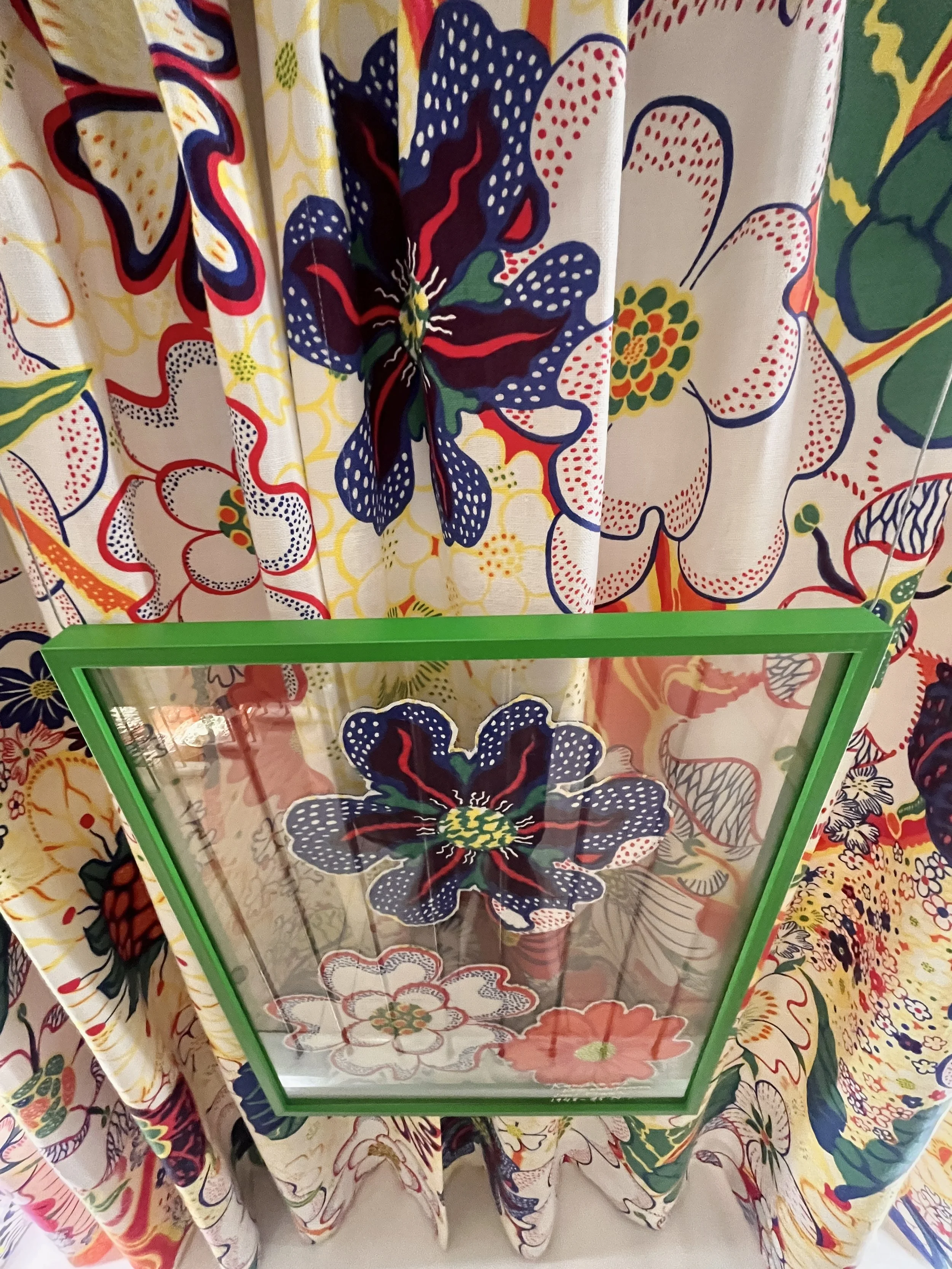
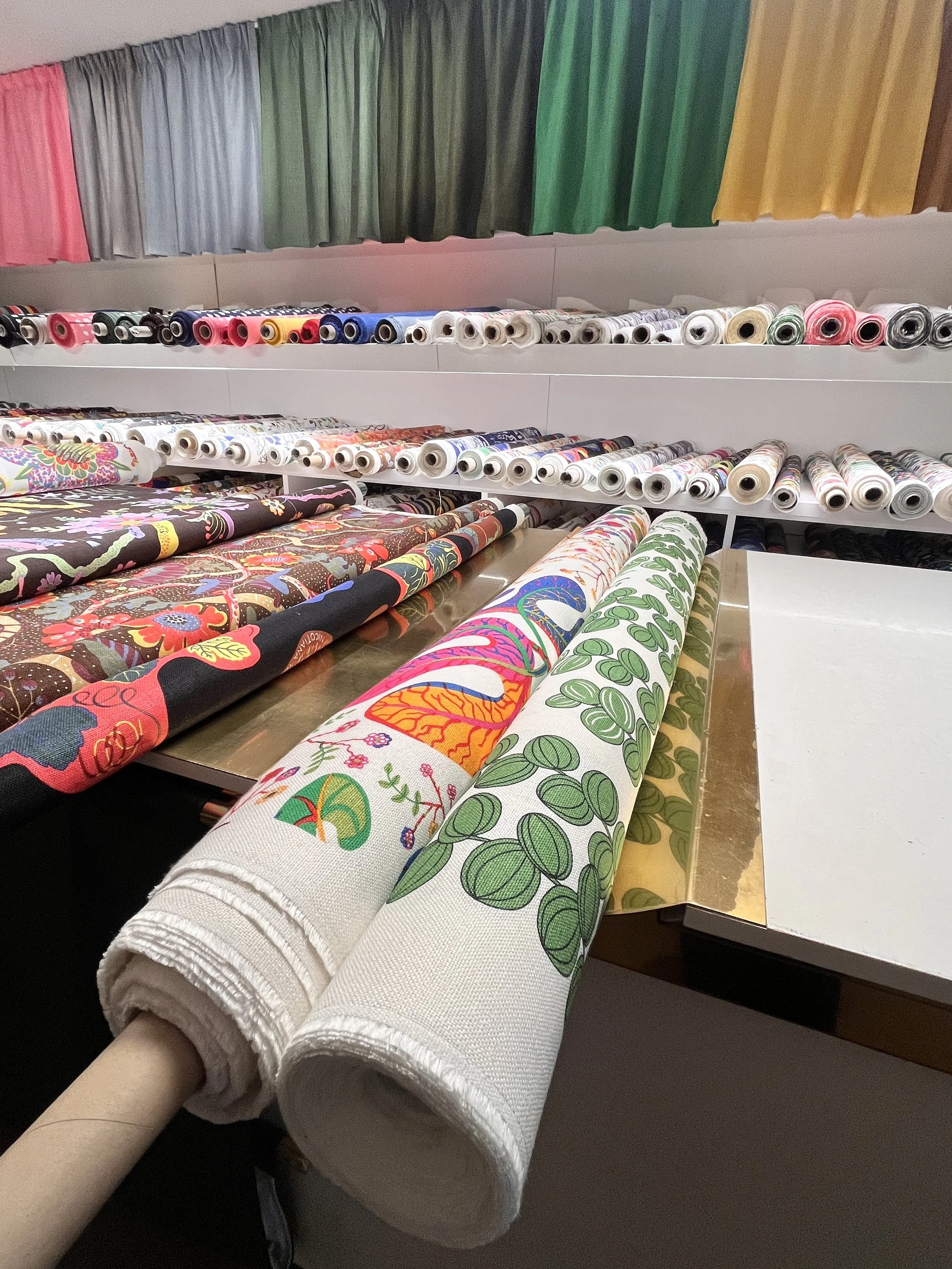
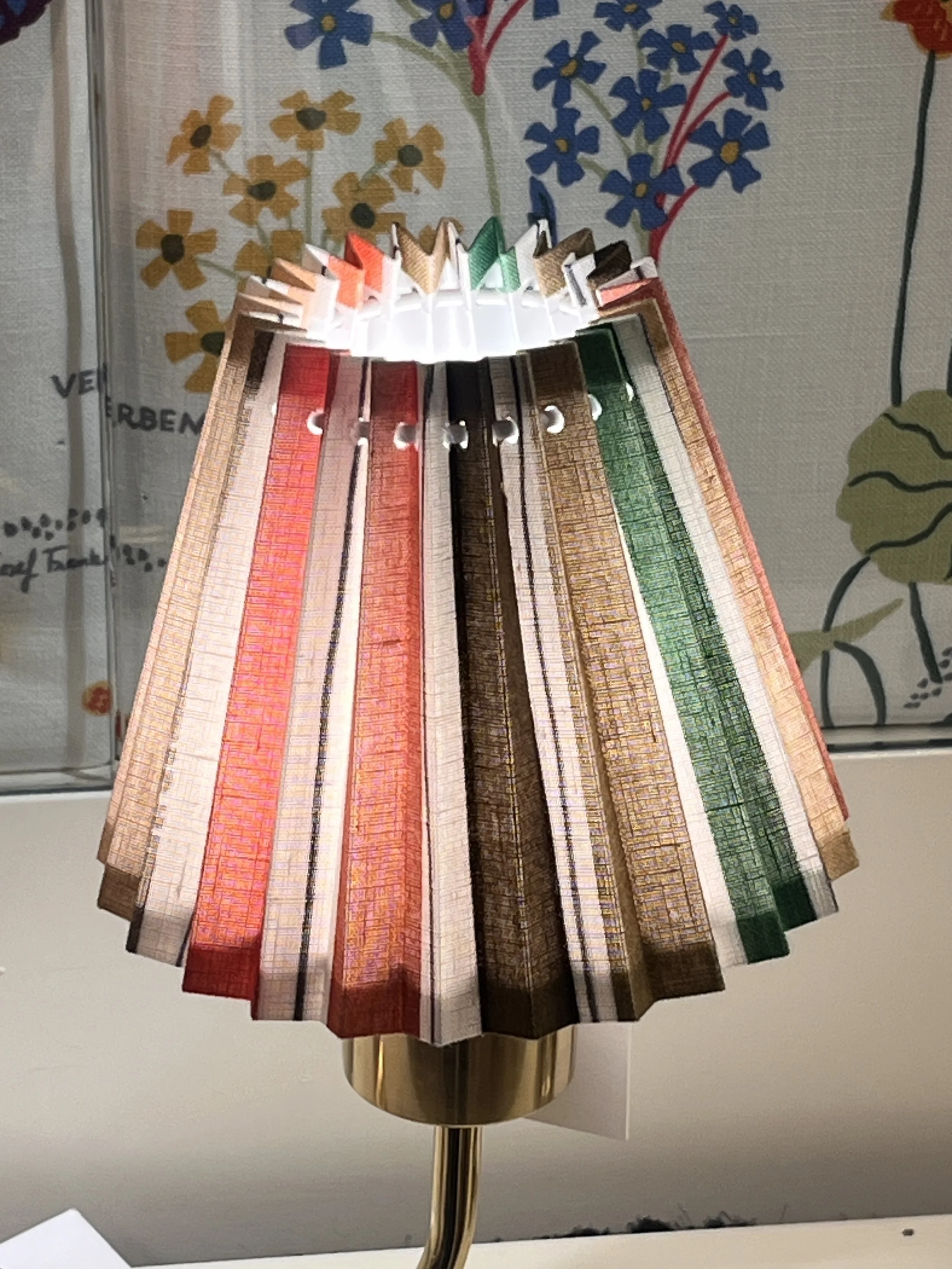
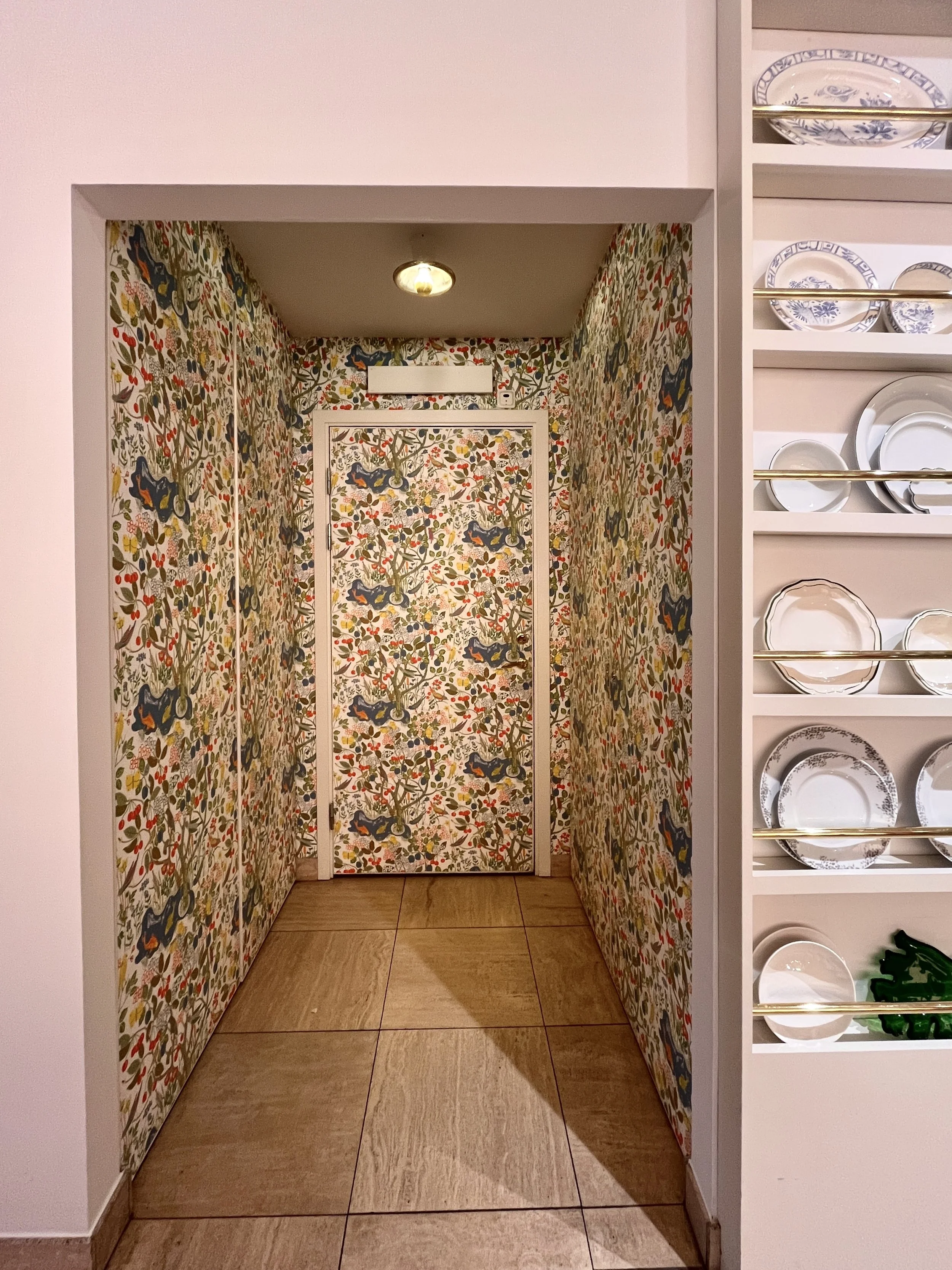
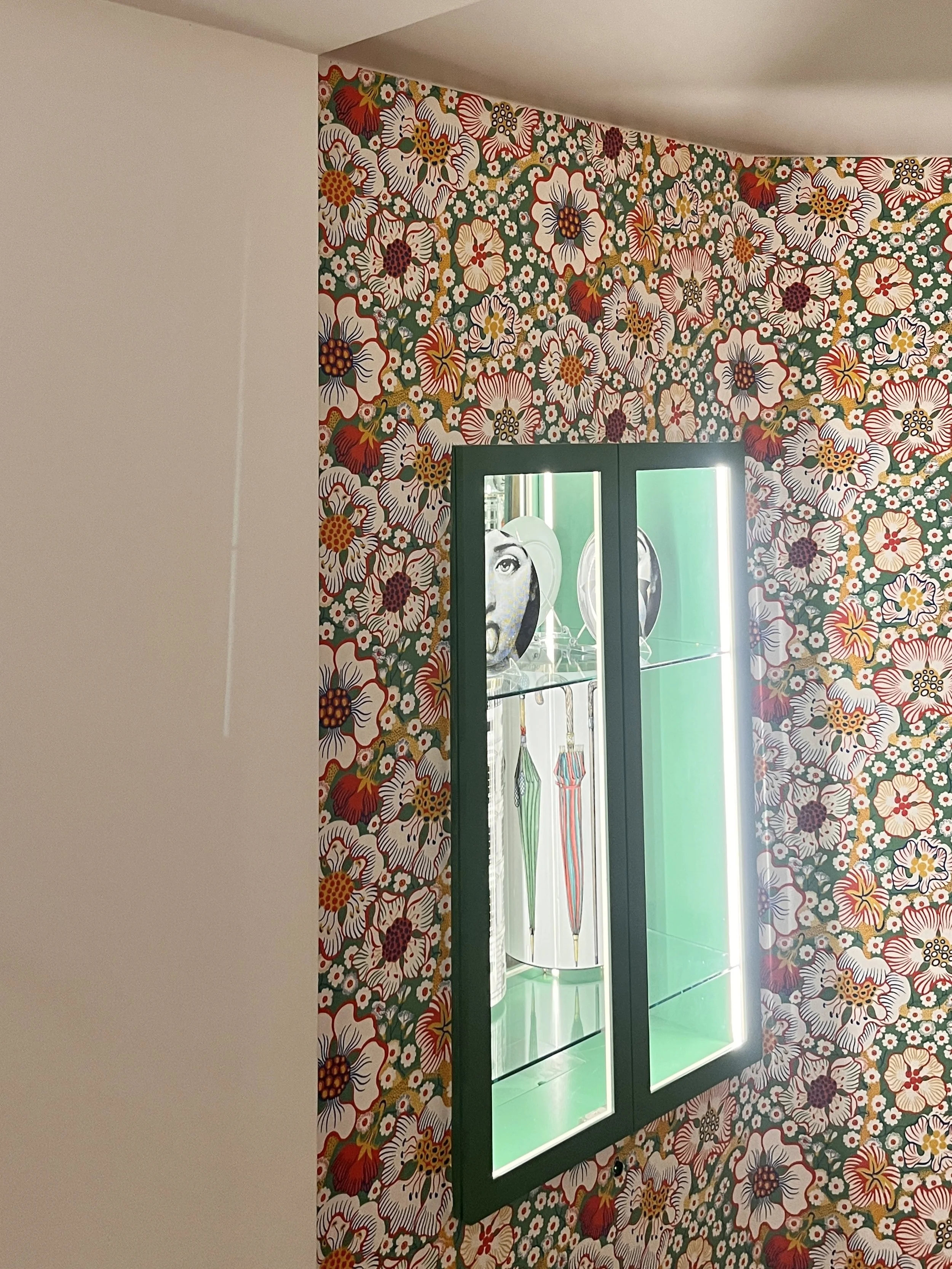
There were so many ideas that made me smile, and many could translate beautifully into residential and hospitality projects.
1. Patterned fabrics with confident blocks of colour
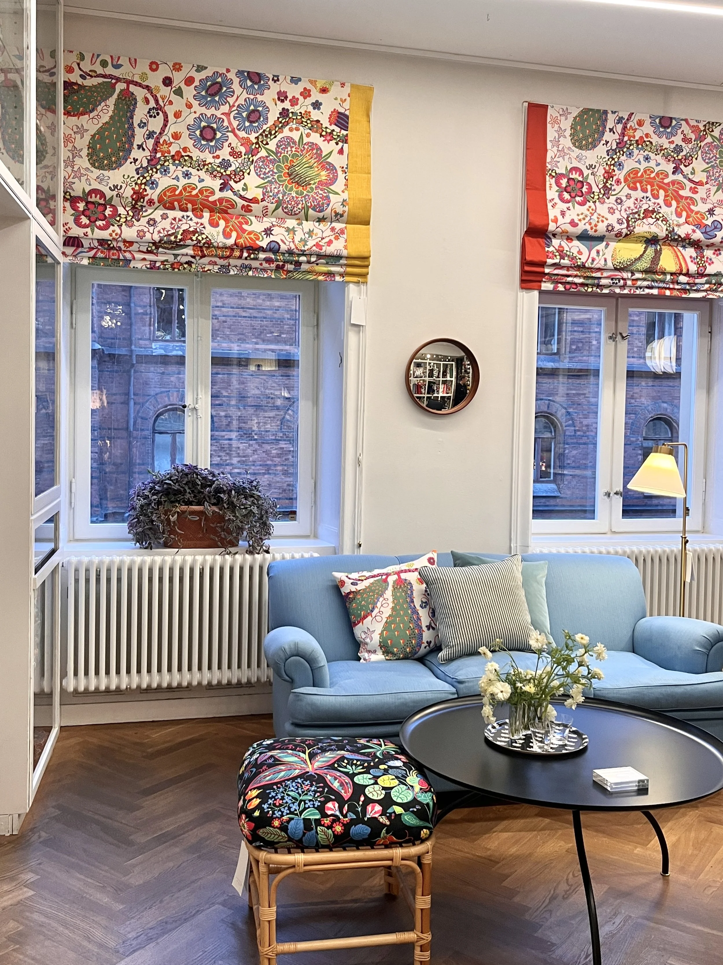
The window blinds looked fantastic, with strong blocks of colour sitting alongside printed fabrics. Rather than allowing the pattern to dominate, the solid colour gave it structure and presence.
It is a lovely reminder that pattern doesn’t always need to be balanced with white or beige. A confident block of colour can be just as effective, creating a visual anchor that allows a print to sing.
2. Painted wall panelling against soft, off-white walls
I loved the red-painted panelling against the off-white walls. The colour was introduced through the flat wall panels rather than relying entirely on painted walls to make a statement.
This is such a useful approach for architects and designers. Colour doesn’t have to be a permanent architectural decision. It can be introduced through a table, a cabinet, a chair or a lampshade, creating layers of interest that can evolve over time.
3. Mixing pattern, colour and natural wood
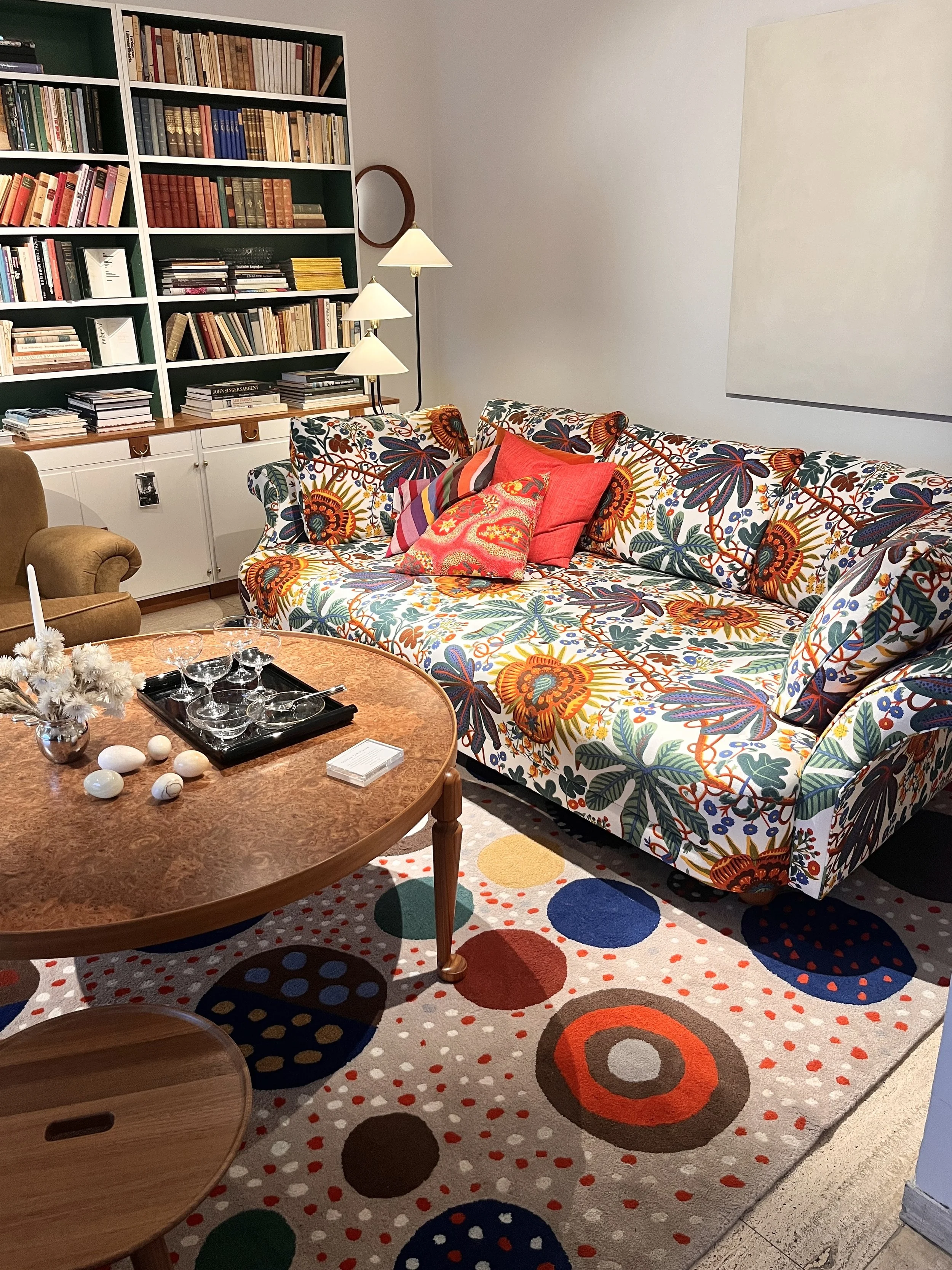
The combination of prints, solid colours and wood felt completely natural. Nothing seemed too carefully coordinated, yet everything belonged together.
Wood brings warmth and grounding to a scheme, while pattern adds movement and personality. The magic often happens in the relationship between them.
4. Striped lampshades with patterned wallpaper
One of my favourite combinations was the use of striped lampshades alongside patterned wallpaper. It is a pairing that could easily feel too busy if approached timidly, yet here it felt playful and confident.
The trick is not necessarily to match patterns, but to find a relationship between their colours, scale and rhythm. Stripes can act almost like a neutral, providing structure alongside a more organic floral or botanical design.
5. Letting textiles become something more
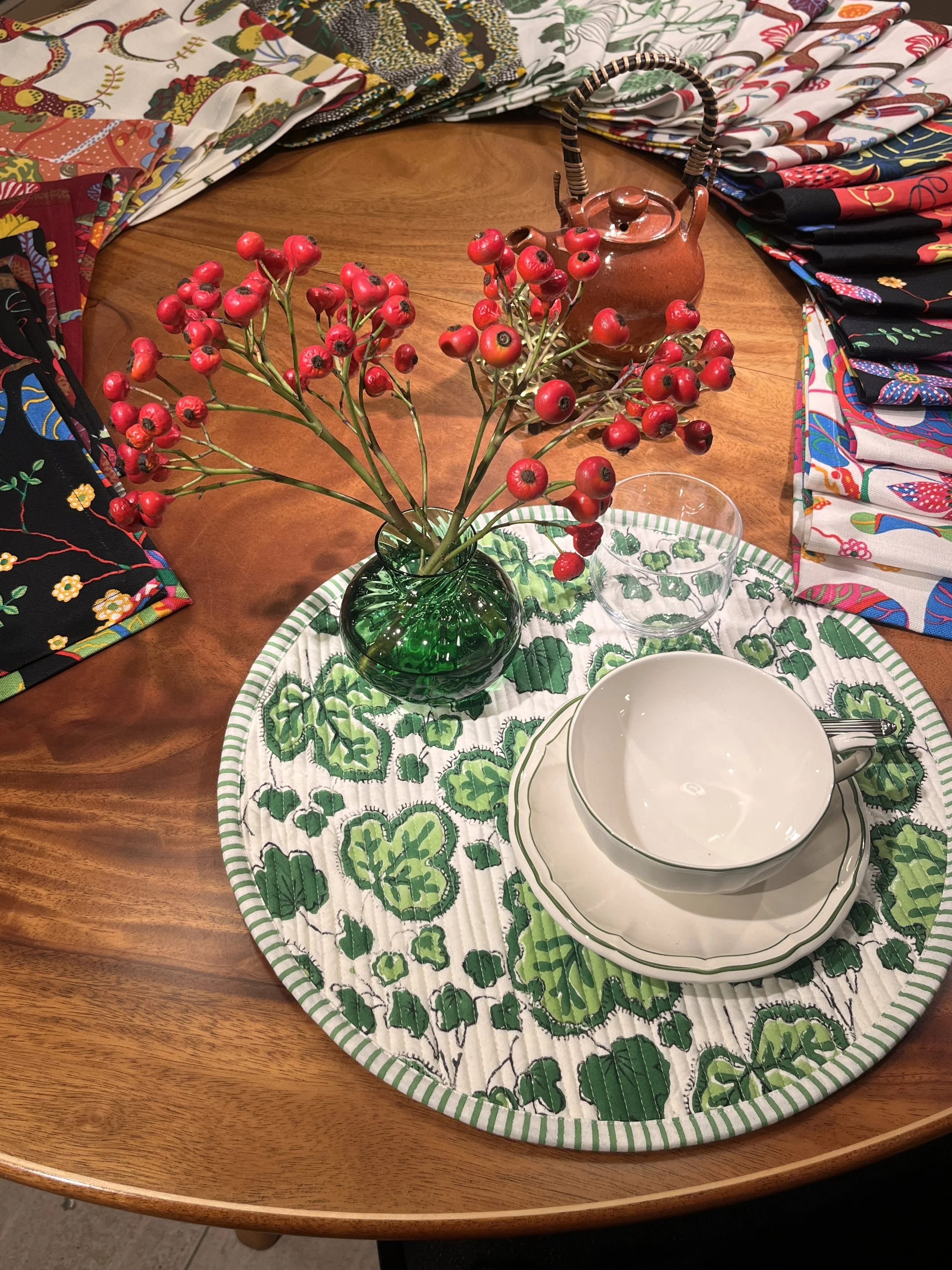
I loved seeing fabrics used to create placemats and decorative, almost painterly pictures. Textiles are not simply something to cover a window or upholster a chair. They can be framed, stitched, layered and transformed into something entirely different.
As a designer and printmaker, I am particularly drawn to this idea. There is so much potential in the material itself, in the quality of the linen, the marks of the print and the possibilities of making something by hand.
6. Mixing the scale of patterns
This is one of the most important lessons for anyone wanting to introduce more print into an interior. Large-scale florals, smaller repeating motifs, stripes and blocks of solid colour can all work together. They do not need to be from the same collection or match perfectly. What matters is the overall balance: the relationship between scale, colour, contrast and the amount of visual space each pattern is given. A large-scale print can be surprisingly calming when it has room to breathe, while a smaller pattern can provide texture and detail without demanding too much attention.
7. Bringing the outside in
Branches, berries and leaves arranged in simple glass jars brought another layer of life into the rooms. It was a lovely, uncomplicated way of connecting the interiors with the natural world.
This connection to nature is at the heart of so much of the work I admire at Svenskt Tenn. It is also what I love about designing textiles: taking inspiration from what I see on walks, in gardens and through the changing seasons, then translating those observations into colour, shape and pattern.
8. Using mirrors to create unexpected views
Mirrors were positioned to reflect rooms and draw the eye into the next space. They added depth, light and a sense of discovery.
For me, this is where interiors become more than a collection of beautiful objects. The way one room connects to another, what you see through a doorway and how light travels through a space are all part of the design story.
9. Wallpapering the doorway - and the door
I loved seeing wallpaper carried onto a doorway and even the door itself. It is such a simple but effective way to challenge the conventional boundaries of a room.
We tend to think of doors, walls and joinery as separate elements, each requiring its own finish. But bringing a pattern across these surfaces can create a wonderfully immersive effect, turning an ordinary architectural feature into part of the decorative scheme.
10. Art that gives a room its personality
Artwork played an important role throughout the interiors. It added another layer of colour, character and individuality, rather than feeling like something introduced at the end to fill an empty wall.
Art, textiles, furniture and architecture should have a conversation with one another. They don’t need to match, but they should contribute to a shared feeling.
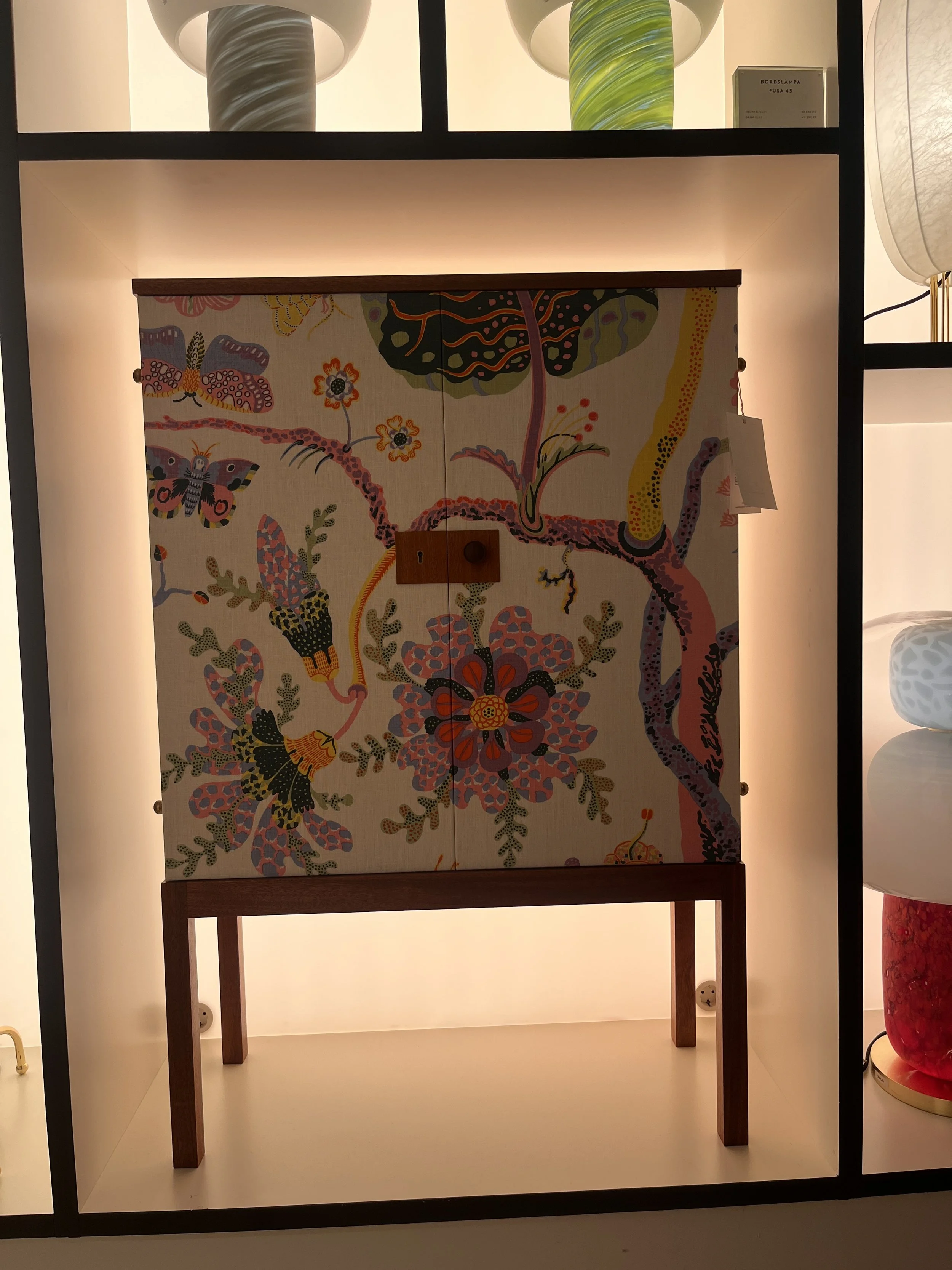
11. Fabric-covered cabinets and beautiful joinery
The cabinets covered in fabric were another highlight, particularly the beautiful joinery details. It was a wonderful combination of craftsmanship and decoration.
This is an approach I would love to see explored more often in bespoke interiors. Fabric can soften the appearance of cabinetry, introduce a surprising layer of pattern and create a connection between the furniture, upholstery and wider room scheme.
Throughout the shop, the quality of the materials and making was evident. These were objects and finishes designed to be lived with, cared for and treasured - things to hand down through generations rather than replace when fashion changes.
That sense of longevity is important. A patterned interior does not have to be trend-led or disposable. When it is thoughtfully designed, using materials chosen for their quality and character, it can become more beautiful and meaningful over time.
Josef Frank: a designer who continues to inspire me
At the heart of Svenskt Tenn’s distinctive identity is the work of Josef Frank, who is, without question, one of my all-time favourite textile designers.
Born in Austria, Frank trained and worked as an architect before moving to Sweden, where he began working with Svenskt Tenn in 1934. Working alongside the company’s founder, Estrid Ericson, he developed a remarkable body of work that continues to define the brand’s approach to interiors.
What I particularly love about Frank’s textiles is the way he brings the natural world to life. His flowers, leaves and botanical forms feel abundant and expressive. They are not simply decorative reproductions of nature; they have movement, rhythm and an almost painterly quality.
His use of colour is equally inspiring. There is an openness and generosity to his designs, with colours and forms that feel as though they have room to breathe. His patterns are full of detail, yet they rarely feel constrained by the need to be perfectly orderly or symmetrical.
For a textile designer, this is a wonderful lesson in observation and interpretation. Nature provides endless inspiration, but the real design work lies in deciding what to simplify, what to exaggerate, which colours to bring together and how to create a rhythm that works across a piece of fabric.
Frank also understood that textiles were part of a bigger interior language. Alongside his prints, he designed furniture, including chairs, sofas and cabinets, creating environments in which pattern, furniture and architecture could sit comfortably together.
His work reminds me that a successful interior does not need every element to be quiet. It needs elements with character, brought together with thought and sensitivity.
A house full of Svenskt Tenn
Another treat on this trip was visiting Millesgården, the home and sculpture garden associated with artists Carl and Olga Milles, where Svenskt Tenn pieces feature in the historic interiors.
Seeing the textiles and objects in a domestic setting offered a different perspective from experiencing them in the shop. It was a reminder that these patterns are not simply beautiful designs to admire on a sample or display. They are made to live with.
There is something particularly special about seeing textiles within a home, surrounded by furniture, artwork, books and the traces of everyday life.
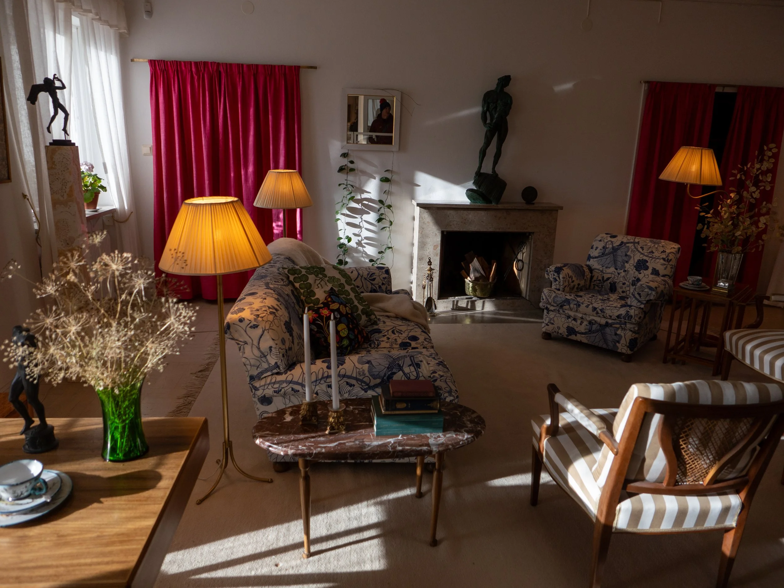
A little encouragement to be braver with pattern
For architects and interior designers, I think there is a real opportunity to be more adventurous with textiles and decoration, even in projects where the architecture calls for simplicity.
A beautifully resolved architectural space can be the perfect backdrop for a generous floral print, a striped lampshade, a coloured blind or a piece of upholstered furniture that brings warmth and personality.
You don’t have to cover every wall in pattern. Start with one element. Introduce a fabric that connects the colours in a room. Put a contrasting print beside a stripe. Try a coloured table against a neutral wall. Look at the doors, cabinetry and window treatments as opportunities for design rather than practical necessities.
And don’t be afraid if everything doesn’t match.
Often, it is the unexpected combination that makes a room feel personal and memorable.
For me, textiles are one of the most direct ways to bring colour, nature and emotion into an interior. They can soften architecture, introduce a sense of place and make a room feel welcoming. They also offer an opportunity to work with skilled makers and to choose materials that are intended to last.
My visit to Svenskt Tenn reminded me why I love this work so much. It was playful, thoughtful, beautifully made and full of ideas. Most of all, it celebrated the pleasure of living with colour and pattern.
Perhaps that is the real lesson: good design isn’t only about how a room looks. It is also about how it makes us feel.
And sometimes, all it takes is a little more pattern.